Healthcare recruitment and home care are often weighed down by cold, clinical communication. As Pro Staffing Locums expanded into Pro Staffing Group, the brand needed to unite two distinct audiences under one clear identity.
It had to signal strict compliance to institutional clients while feeling warm and reassuring to families seeking home care.
Strategy
Serious but Relatable
Our strategy balanced operational authority with genuine human empathy.
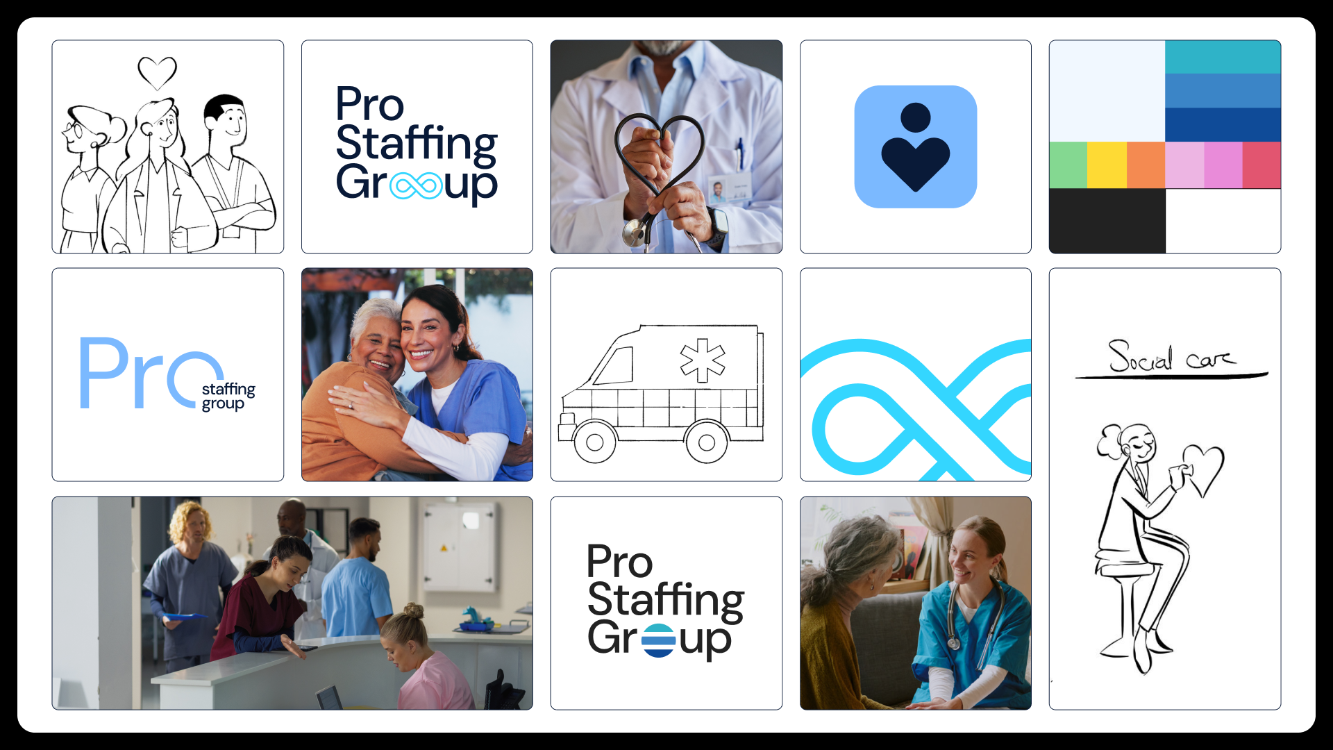
We moved away from early illustrative concepts that felt too playful for high-stakes care, creating a grounded system built to carry their shift from a niche locums agency into a full-service care and recruitment group.
Identity
The Core
We merged the human silhouette of recruitment with the universal symbol of care to create a clean, geometric mark.
Paired with DM Sans for straightforward legibility, the system replaces sterile clinical whites with a calm sky-blue palette and authentic photography that keeps real people in focus.
Application
Dual Dedicated Pathways
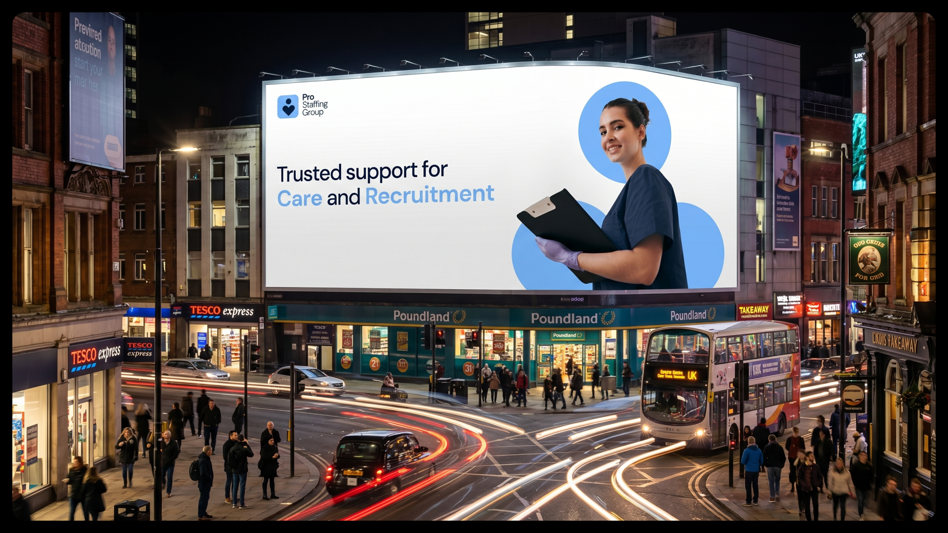
From private home care to institutional staffing, the new website speaks one cohesive language.
Using soft, rounded UI components and a signature heart-shaped photo frame, the platform splits into two clear journeys: a supportive Home Care hub for families and a streamlined Recruitment pathway for organizations.
Outcome
Elevating Essential Utility
The new brand and website complete the transition from Pro Staffing Locums to Pro Staffing Group. By pairing institutional trust with human warmth, the platform simplifies complex care and staffing decisions with total clarity.